Setting the Visual States for the Honeycomb Control
Before working with the Visual State Manager it will help to understand how the Honeycomb’s appearance is connected to the collision detection code. As you’ll see, the consistent naming of objects and actions is always very important to maintain.
Open the BeeHive Solution file in Expression Blend and then double-click on the file Collision.CS. Scroll Down to Line 123 and locate the following comment: //If Action is GoToState, trigger vsm state called “IsCollided”.
This comment is followed by the necessary code. Essentially, what this means is that when a collision between the ball and a honeycomb take place, the code is expecting to launch a state with the name “IsCollided”. This state will be a change of appearance of some sort, however it doesn’t exist yet so you will need to supply one.
Select the honeycomb immediately above the paddle, then right-click it and choose Edit Control. This honeycomb object is a user control, which means you can edit its appearance manually, but you can also add a Visual State to it. This is a good idea because when you begin duplicating the honeycombs it would be very inefficient to have to set the appearance for each one. The UserControl will be the original and all copies will be linked.
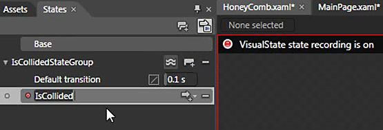
Choose Window > States if necessary, or just click the States panel if it is not visible.
In the States Panel, click the Add State Group icon to create a new state Group.
Name this group IsCollidedStateGroup. A state group is the collection of states that you will begin to set. In standard controls, such as the Button example mentioned above, you have predefined states within a group such as MouseOver, Pressed, etc. Here, since you are working with a UserControl, you get to create your own.
Immediately below the state group is a section labeled Default Transition. Whenever one state transitions to the next, it creates an animation over a length of time, changing this transition duration can create different effects. Click inside the value for the transition and type 0.1. This will create a rapid fade out when the ball hits the honeycomb.
Click the Add State icon (immediately to the right of the Add State group icon) and a new state is created. Name this state IsCollided. Pay careful attention to the case of the text, this is state referred to in the code in step 1 and it must match exactly.
You will also see a red border around the artboard and the label VisualState state recording on, this is an indicator that any change in appearance you make will be recorded. By default, the original appearance has been set and is labeled Base and can be seen at the top of the State panel.
The desired appearance change you will be setting when this honeycomb is hit is to make it disappear. Select the canvas labeled Honeycomb in the Objects and Timeline panel, then in the Properties panel, locate the Appearance section and change the opacity to 0%.
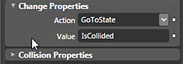
Return to the main page by clicking the MainPage.xaml tab. Rebuild your application by choosing Ctrl+Shift+B. Select the honeycomb and expand the arrow on the left if necessary to expose the Collision behavior. Click it once to select it.
In the Properties Panel, locate the Change Properties section, then click the Action menu and choose GoToState, then type the value IsCollided. Now the Collision code we referred to earlier will be satisfied, whenever an object collides with the honeycomb, the 0% opacity state you created will be played.
Test your application by pressing F5. Click the ball to launch it. When the honeycomb is hit, it will fade out. Tip: If you want to experiment with different fade out effects, return to Blend, select the Honeycomb and right-click it to edit. Then within the States panel change the value of the default transition.
 SELFPHP


 SELFPHP OHG, info@selfphp.de, Impressum, Kontakt