Venture into Gaming Using Expression Blend: Module 3
Understanding Layout Containers
Before you get started creating Silverlight projects in Expression Blend, you’ll need to tackle one of the most fundamental aspects of the XAML workflow: Layout Controls. If you’re familiar with XHTML and CSS, many of the XAML layout controls will be intuitive for you. If your main experience with layout is print or Flash based, you’ll need to learn some basic concepts in order to fully grasp the purpose and proper roles of the XAML layout controls.
Nested Objects: An Overview of Layout Controls
In XHTML, elements such as divs and lists allow you to group content into a box or a list. Many of these elements have visual properties that can be adjusted with CSS, but at heart, they serve the purpose of organizing content into meaningful structures. Organizing content inside of layout elements in XHTML or XAML is very similar to organizing your kitchen. If you take the time to invest in some clever accessories, you can keep your silverware separated, keep your knives safe and easily accessible in a block, and keep your pans up and out of the way with a ceiling mounted rack. In XAML, there are elements named layout controls that have been created specifically to organize content into common layout scenarios. For instance, Stack Panels can be very good for organizing navigation items, Grids do a great job of providing a structural framework for a UI, and Canvases are handy for situations where you need exact positioning.
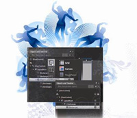
Just like in the kitchen analogy, XAML layout controls can be nested one inside the other. A large cabinet may contain a number of containers to organize smaller items, which in turn may even contain even smaller containers. When we nest containers inside of one another in XAML, we refer to their relationship to one another using the family tree metaphor. For example, a parent may contain a child, which in turn contains two more children, which in turn contain three children each. It gets confusing trying to keep track in your head. Luckily, Blend gives you a very intuitive visual representation of this relationship.
In this section, you’ll be exploring layout elements and learning which element to use for each layout scenario. We’re going to start with the Grid and Canvas controls. These controls can be thought of as the main building blocks of a layout in blend. They are the most flexible and farthest reaching in scope. The rest of the layout controls typically focus on more specific and minute layout situations.
The Grid Control
If you’re familiar with tables in HTML (or in most layout programs), grids vaguely resemble these elements in the sense that content can be structured in rows and columns. Logically enough, this layout structure is the “grid” in the Grid Control. The real power of the grid control though, is the degree of precision available for managing the relationship between content and container.
A typical example of a grid in practice would be an expandable UI. If you are working on a computer right now, most likely the program you are using allows you to resize the workspace window. When you do so, the panels and tools of the UI rearrange themselves to compensate for the available screen space. Generally the document window will become smaller, but important high level elements like the main menu will remain visible at all times. Creating UI’s with this kind of expandable layouts in Blend is achieved using the Grid Layout Control.
 SELFPHP


 SELFPHP OHG, info@selfphp.de, Impressum, Kontakt